Neon Noir
Hello everyone and welcome to our end of week devlog.
We've been off for a while, taking the last week to regroup and take a rest after some issues with the core systems. We are still resolving the issues and should be ready soon.
In the meantime, I have been spending the week practising with some free asset packs that went up on the Unreal Marketplace this month. It's good to practice on free assets like this. Taking pre-built areas and turning them into something useful and even presentable is a skill. When I was starting out, I used to think badly of pre-made assets, always seeing examples of asset flips on Youtube videos about shovelware games on steam, but that's not necessarily fair since those were bad examples of what the assets were for. Bad uses are asset flips; simply taking the assets as they are and using them as playable levels in games. That's not what they are for. They are for taking and modifying so you as a level designer don't need to commission tones of bespoke assets for your project. That would be in no way cost-effective for what you are trying to do. if you've done it right, it shouldn't look like it came from an asset pack at all.
I built three new levels. Of them, two may wind up in the game as explorable areas.
The first kit was one called Downtown West, a pretty generic group of buildings in the form of a strip mall. With a week to myself, I decided to turn it into a seedy shithole! First thing I did was remove everything that was on the ground. All the chairs, flower pots, bins, all of it. Clear it all away and ready the area for transformation, a little like building projects in the real world. Then I carved a moat of nothing through the centre of the map, turning a strip mall into a street. This was fairly easy but very time consuming since the ground tiles were not even to have a sandpit of some kind in the centre. Once done, I added in some road tiles from the Hell's Kitchen area, as the tiles in the asset pack didn't look good. Once the new road was in place, I made the most important change of all.
The sun needs to go.
Darkness is the best friend of Film Noir Cinematographers and cheapass Level Designers. Darkness can hide a lack of detail, the true nature of assets and let the player fill in the blanks with their budgetless imagination, in turn making it a far more personal experience for them. The power of suggestion is immensely powerful and a far better tool than simply paying for more assets that would bankrupt us and leave the player less satisfied in the long run.
Once the sun was shooed away, I began adding in assets from another toolkit that went up for free this month. An airport hanger level. The hangar structure itself was of no use to me, but the industrial pipes, wires and walls were. In the world of Dead Heat's New York, there exist areas that have such little population that they are folded under the local jurisdiction of larger neighbourhoods such as Hell's Kitchen or Little Tokyo or Midtown. These 'Dead Zones' are sparsely populated and contain few amenities. Their few residents utilize the broken old-world buildings for various purposes such as bathtub gin distilleries, drug labs or sometimes even as actual residences or businesses. This gives the area a very post-apocalyptic industrial feel that I wanted to show off as much as I could.
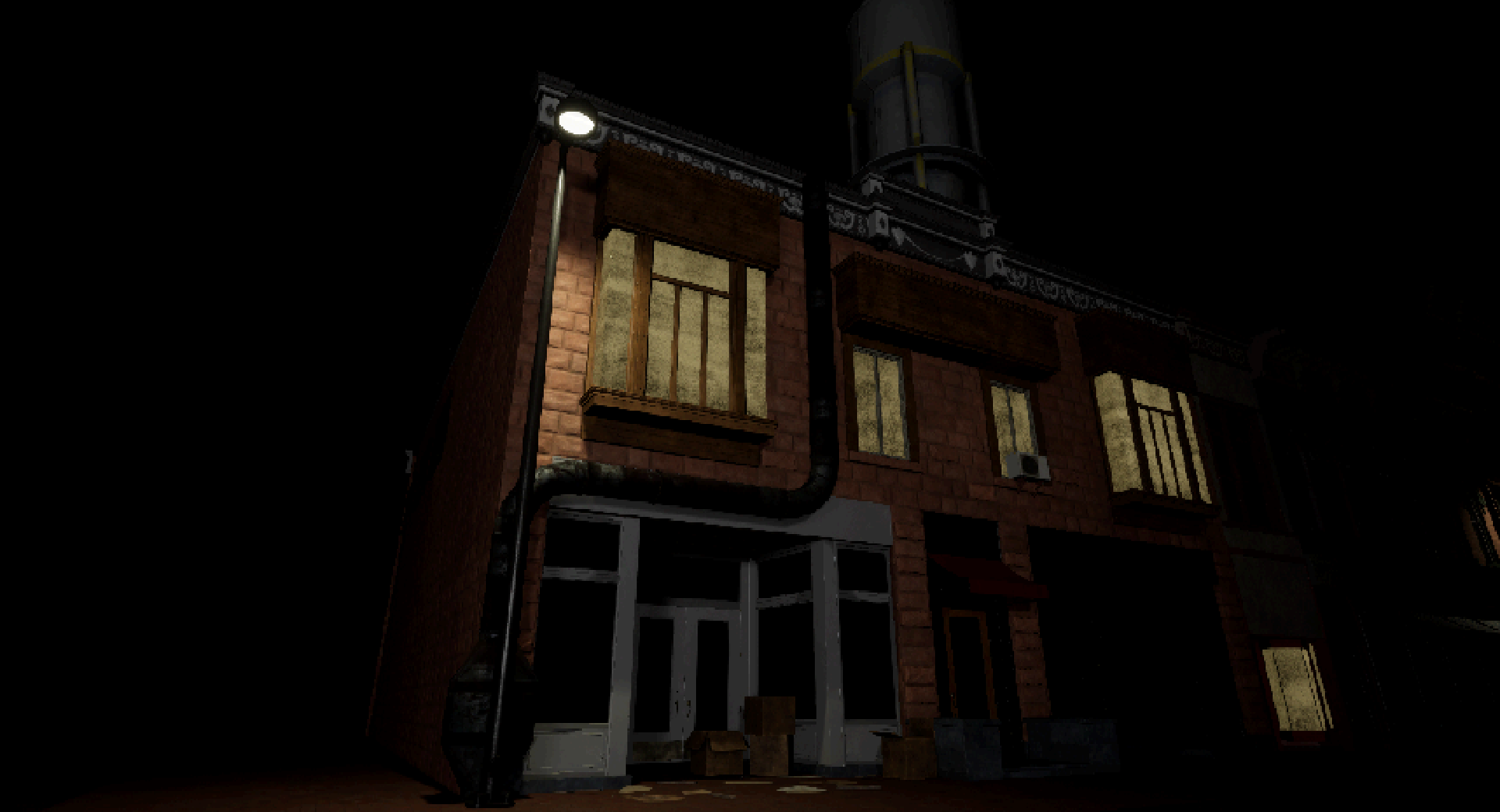
The true purpose of these pipes is unknown to the player characters.
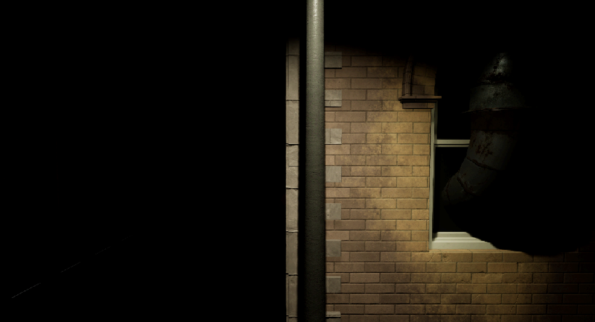
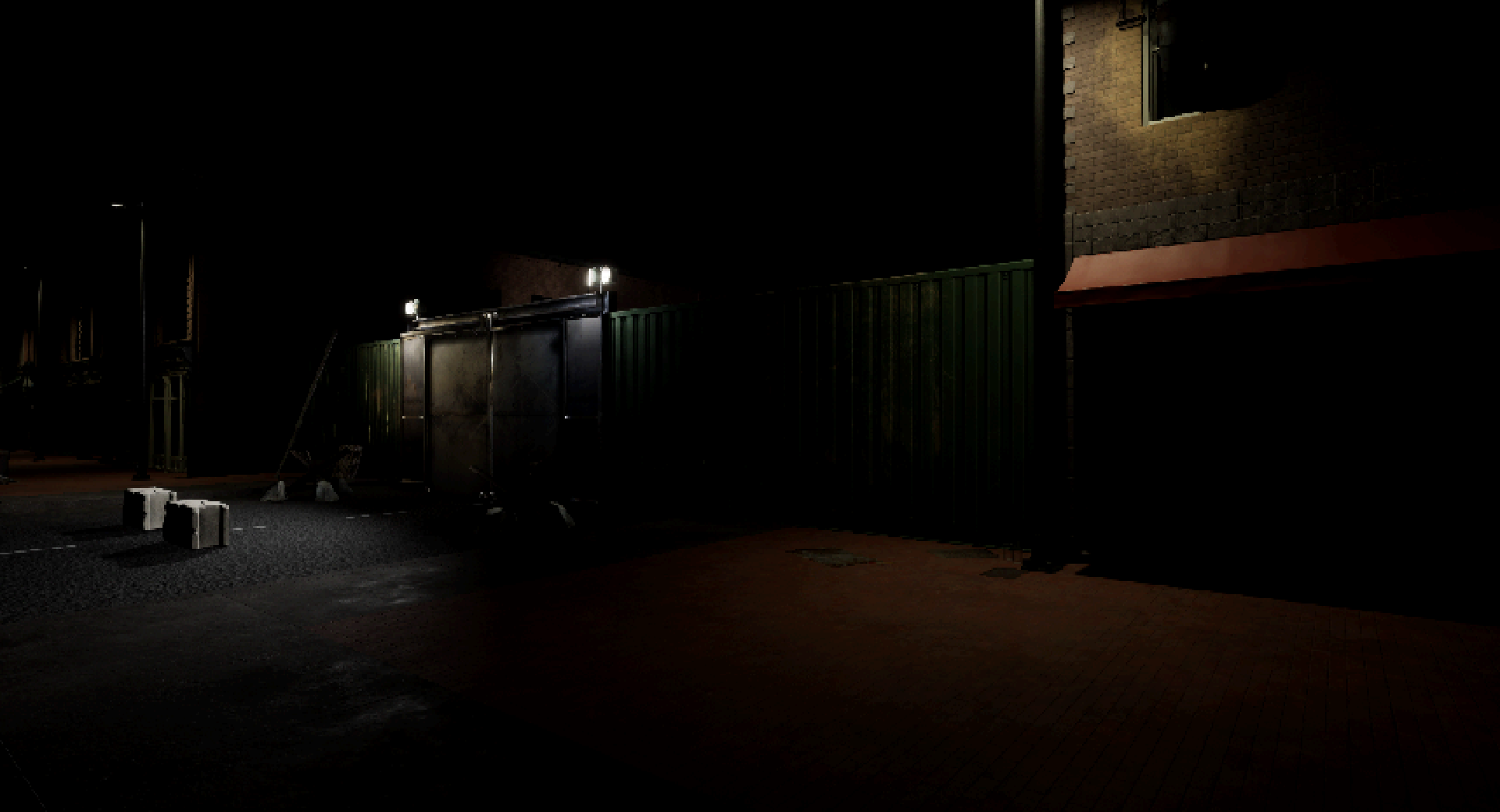
Inside the asset pack, I found a set of hangar doors and some metal walls. I stewed over a few ideas in my head before remembering writing down a brief description of a historical event within the game's lore in the design document, about a period between 2051 - 2058 of makeshift containment zones or ghettos for Zombies being erected to separate them from humans while they deliberated over whether they were safe to return to society with them. I had planned for this to be mentioned, but what if I could show it as well? Not active, but as a rusty standing relic of those earlier uncertain times?
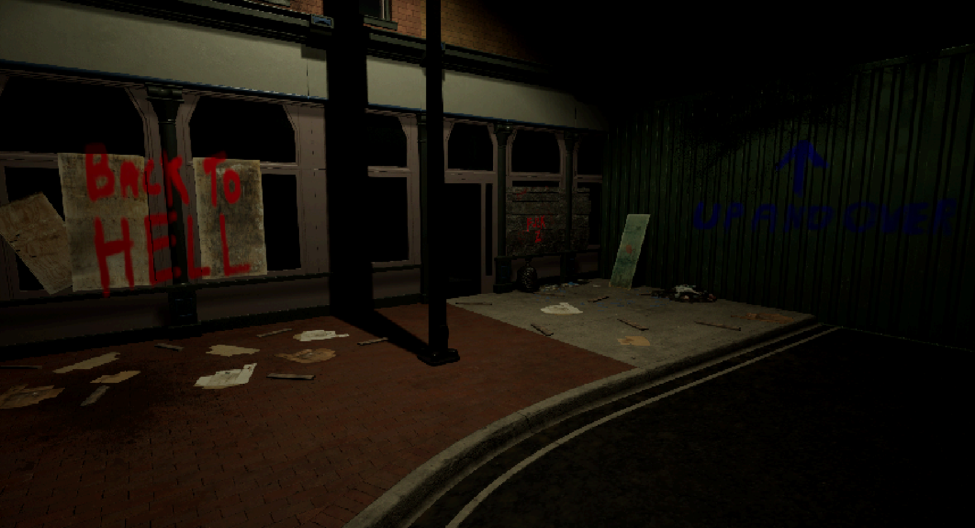
Stains and decals were a focus of this area and a challenge for me to create them. I learned how to make decals in unreal, but I wanted to try my hand at making textures for them from scratch. Most of them were graffiti at first, but soon I started making painted advertisements and a couple of dirt textures. Decals and other small props can let you make some good environmental storytelling.
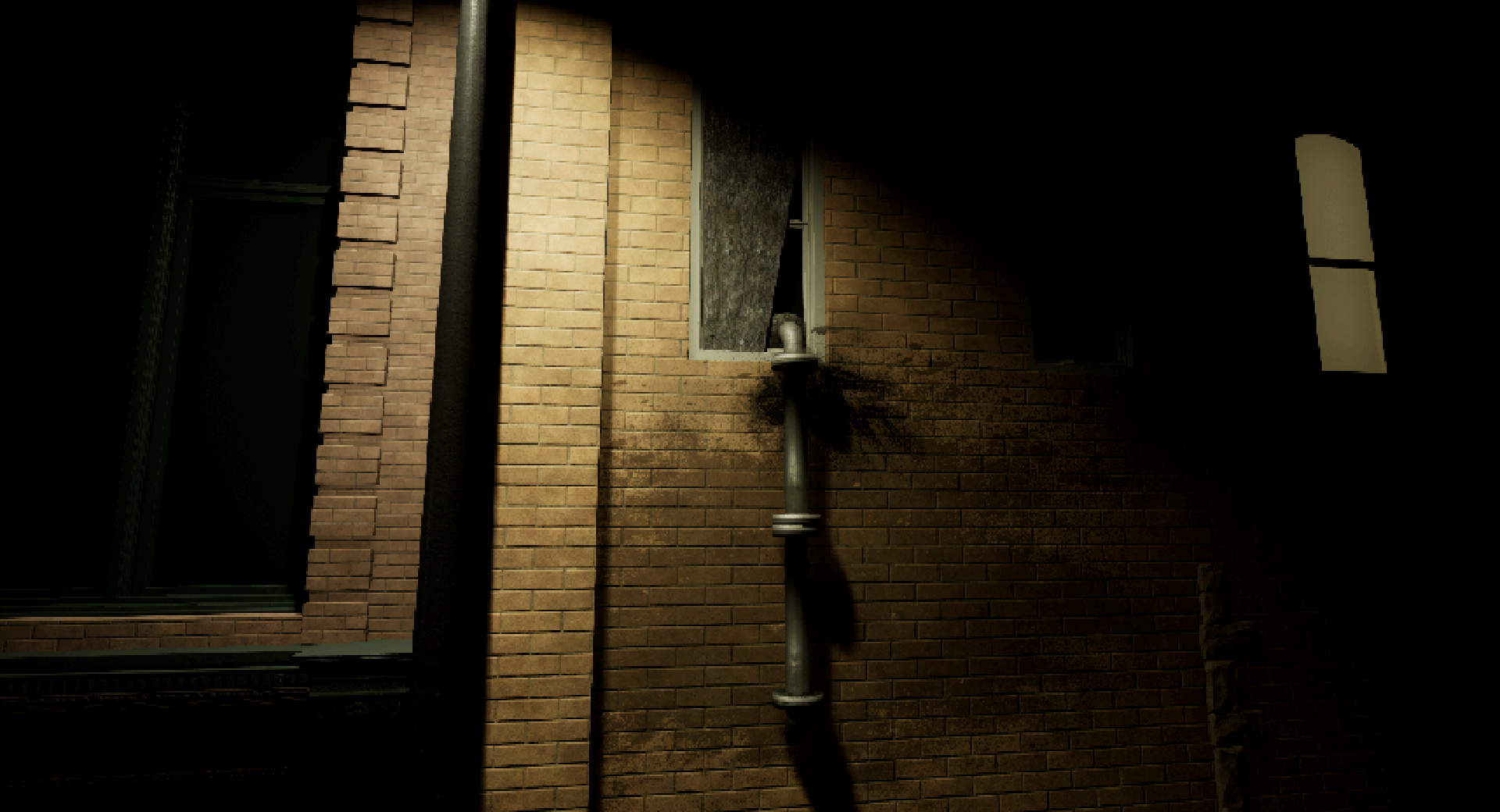
After setting up the smaller details, I called it there for the time being with the level and named it DeadZone-LT1178, you may see it in the full game one day!
The week still wasn't up, so I started work on another level, this time using some assets that were permanently free on the marketplace, a bigger challenge to use assets that are available to everyone and make them look unique. I grabbed the assets and started to look through them, I saw that they were themed around ruined buildings a few Chinese and Japanese signs. A Little Tokyo level is planned for the full game, but that area would be far more authored. I started building a Chinatown themed level with no real plan in mind. I would just start placing the buildings and see where my imagination took me. After placing the buildings and lighting, I liked how well the buildings looked in the moody lighting, but the area lacked a lot of variety. Moreso than the last asset pack.
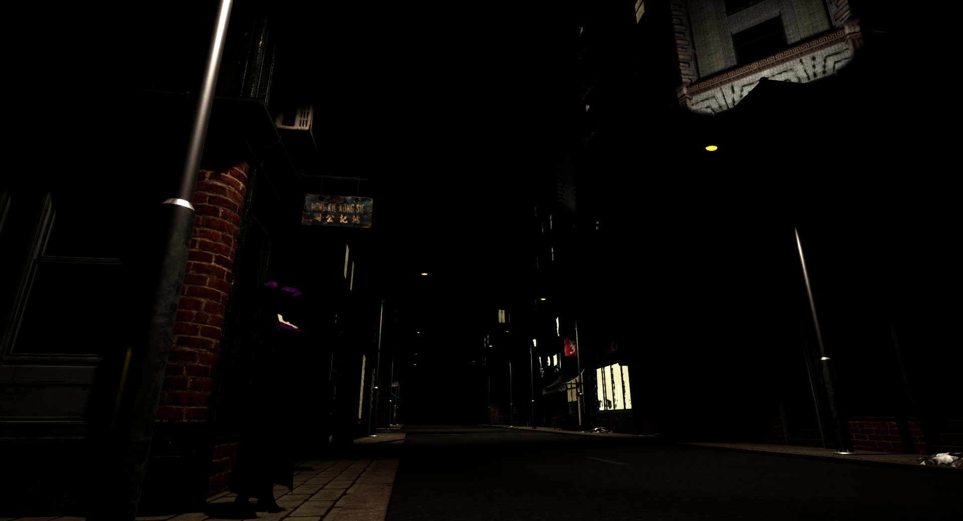
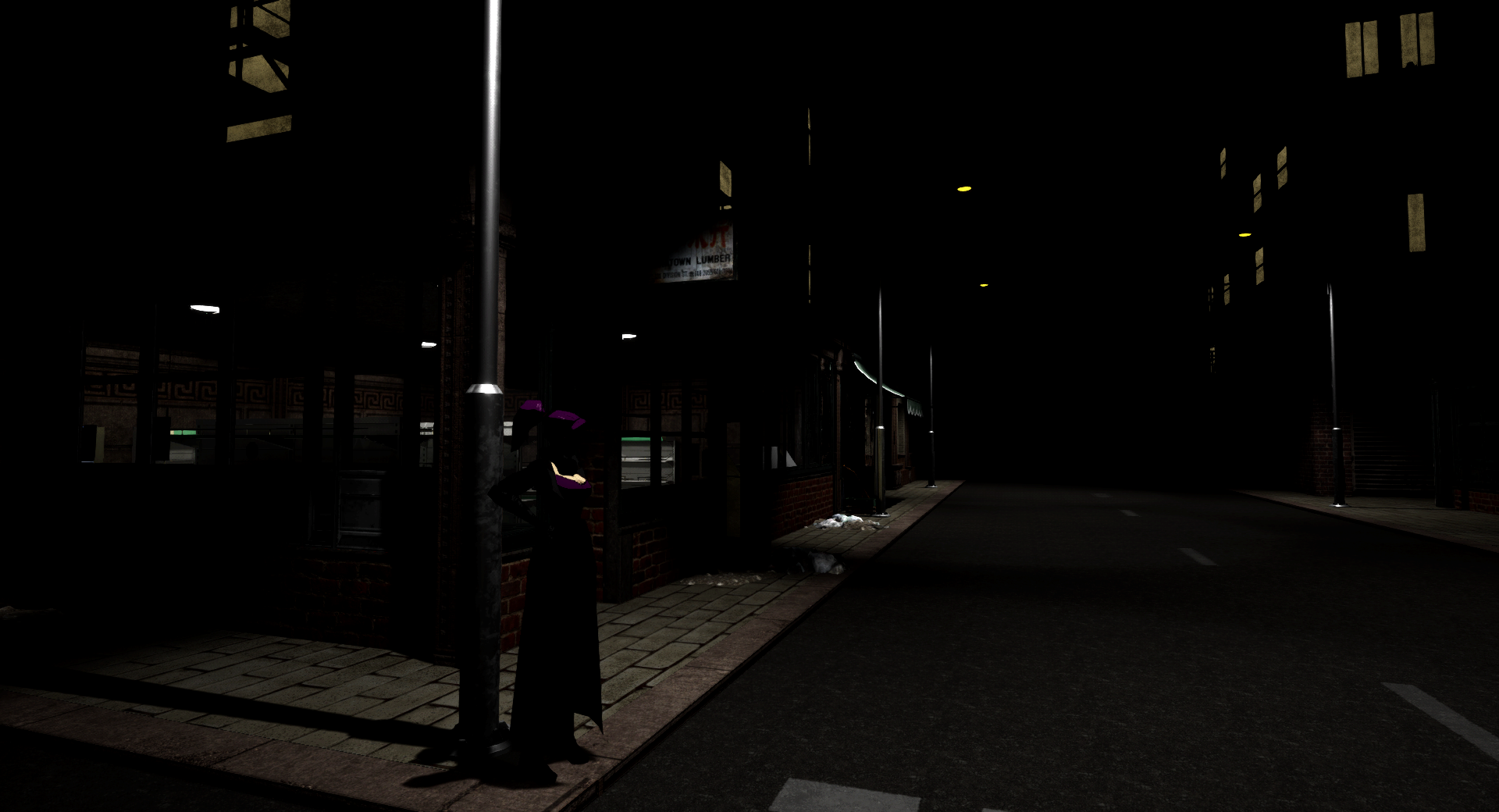
Not bad, but not great either. What it needed was some Neon.
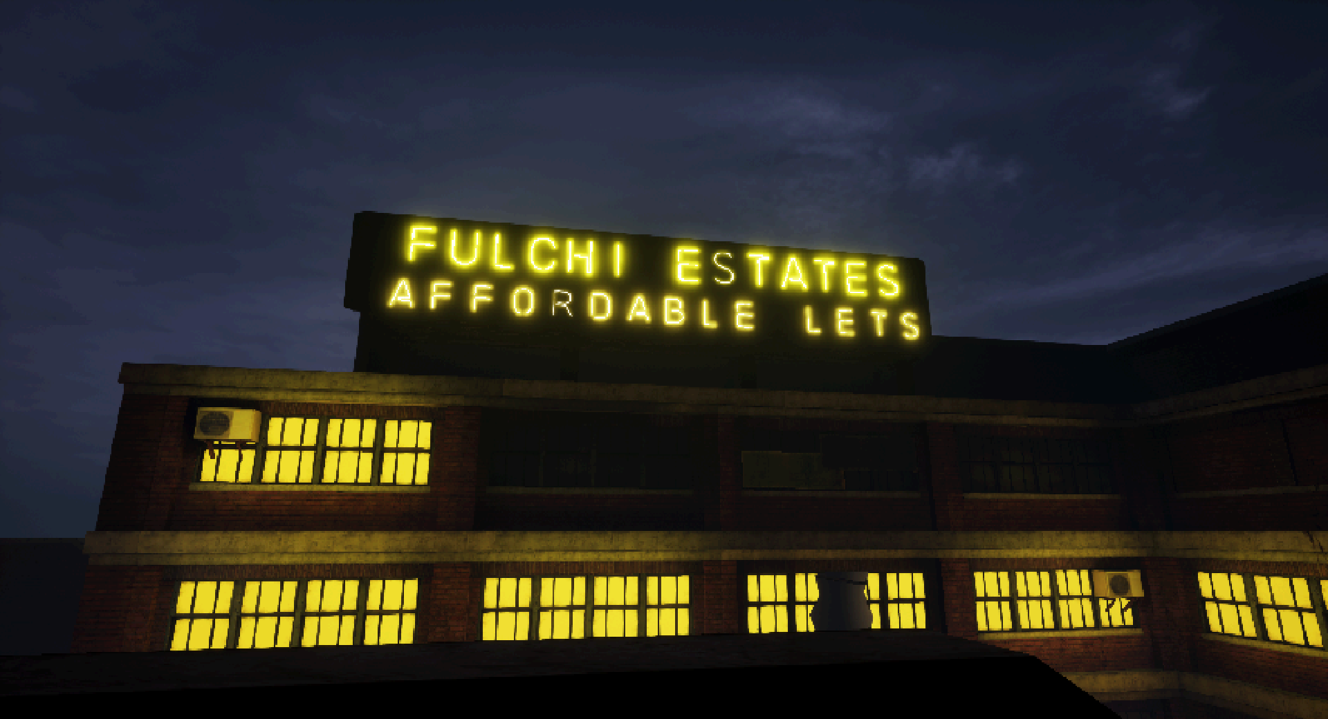
Our environment artist is going through some technical issues at the moment, so I could not commission any quick neon signs, so I looked around on the marketplace for an alt. What I found was far better. A tool for writing and creating my own neon signs without needing to use Blender. The tool allowed for writing English words in neon easily, but any special characters, images, or Chinese & Japanese characters would need to be handwritten using splines.
The result...
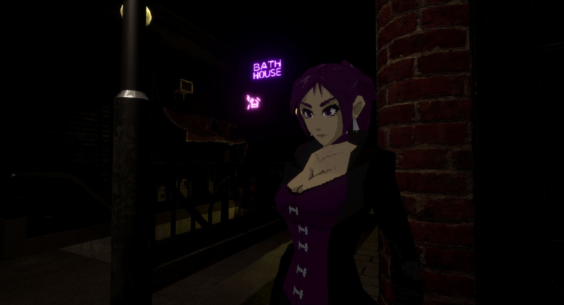
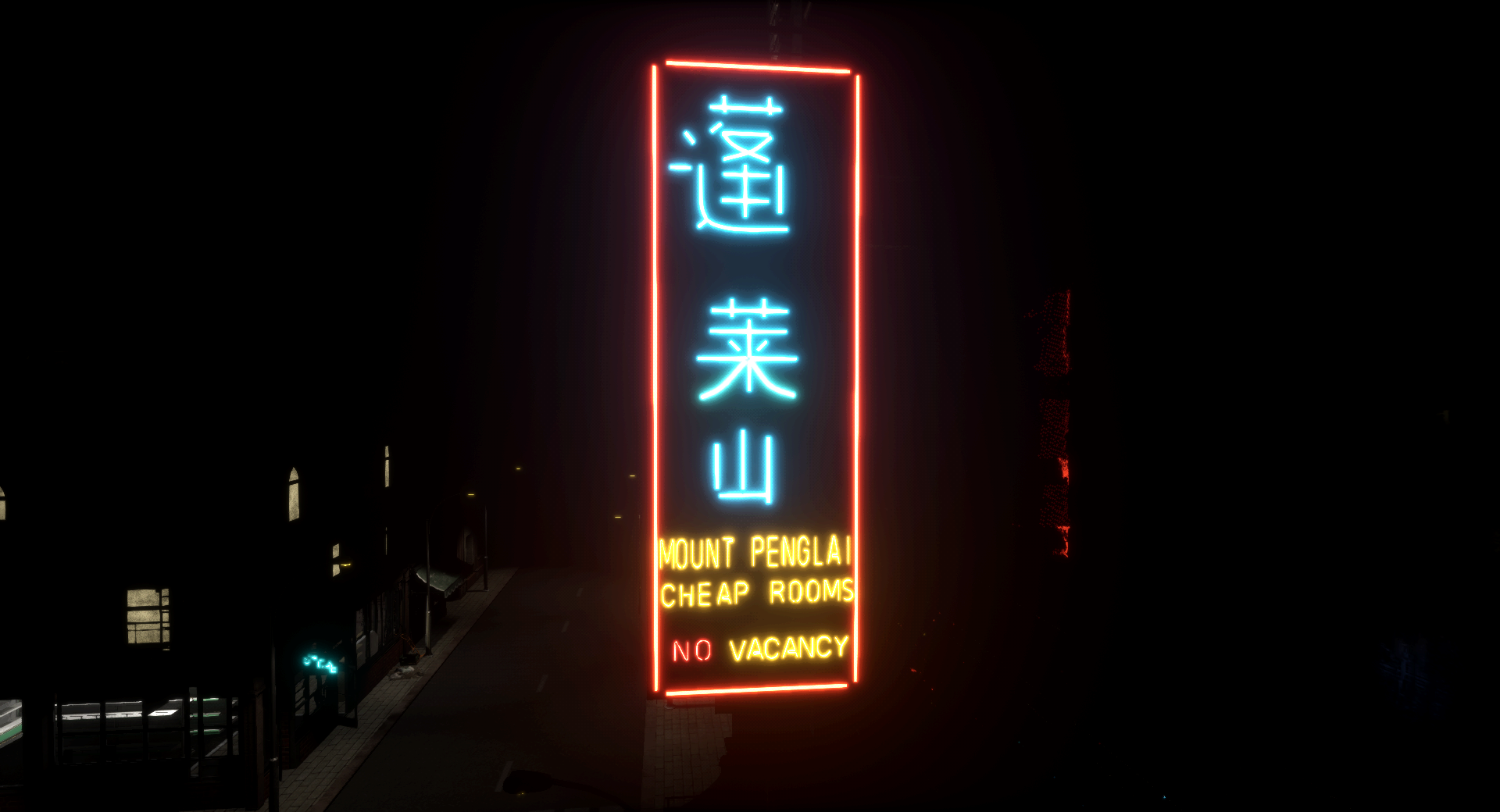
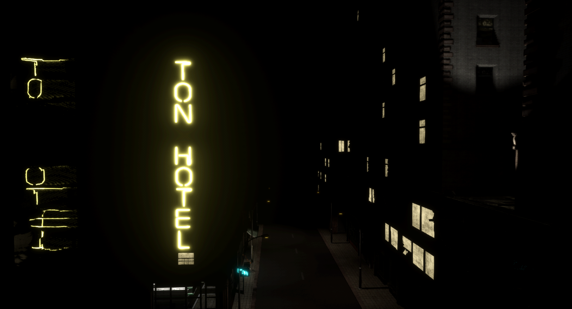
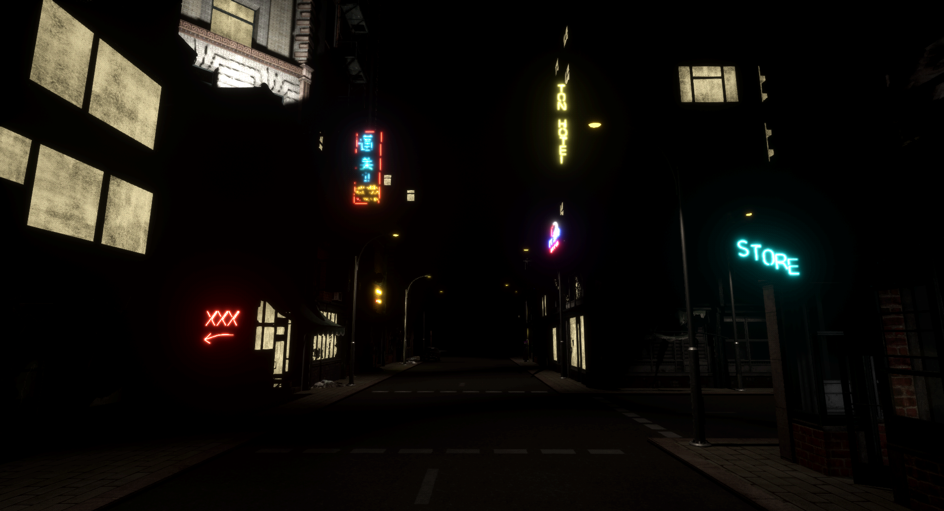
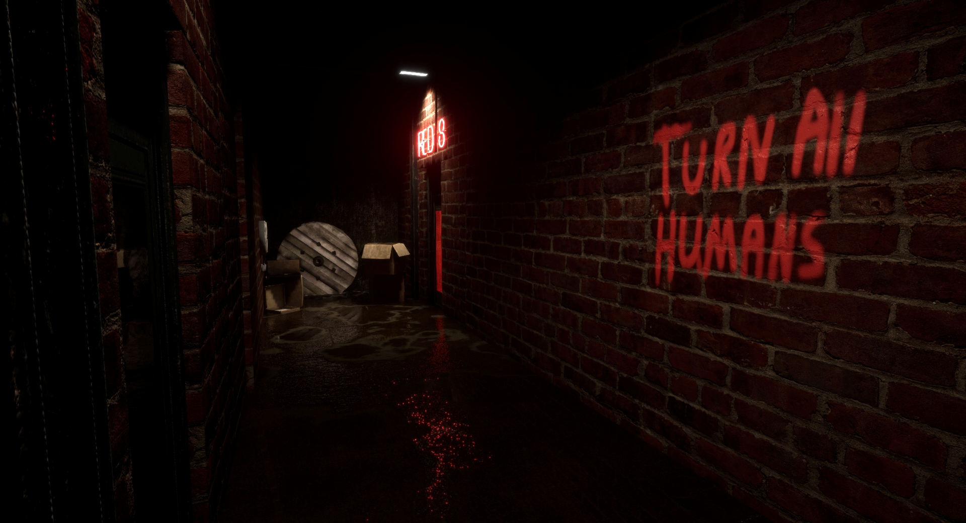
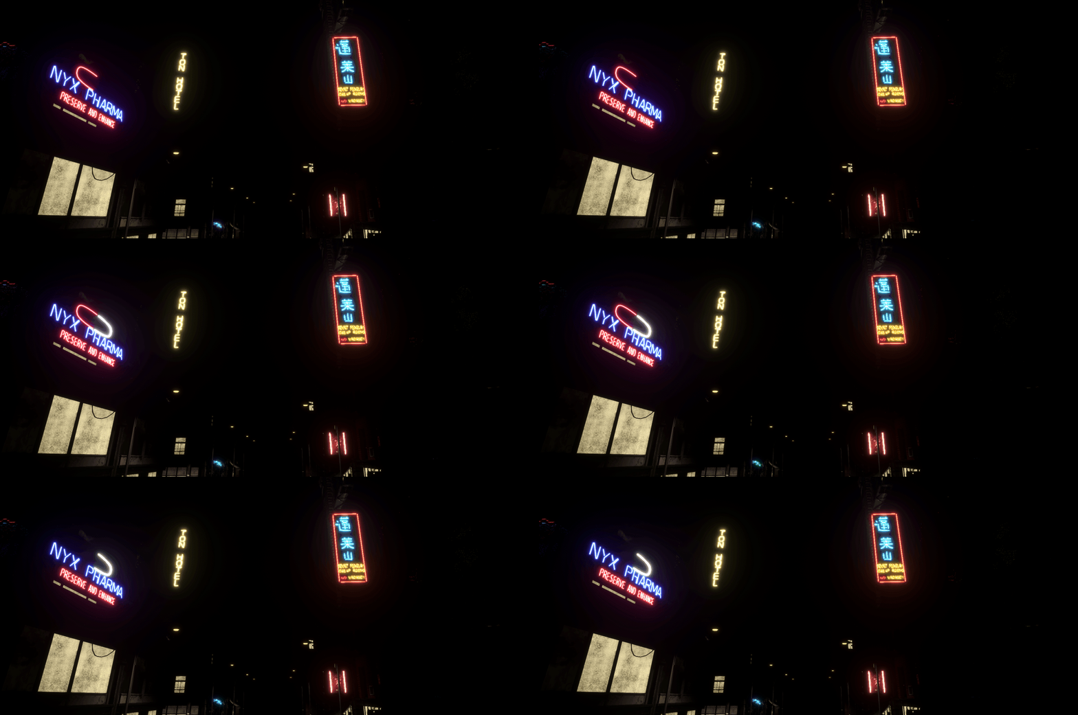
I am very happy I found that toolkit for neon. After fixing up the Chinatown level, I decided to go back to the Dead Zone and see what I could do there. The building on the end always had purple lights indicating something seedy going on inside. Now I can make the signs that reflect what the establishment is.
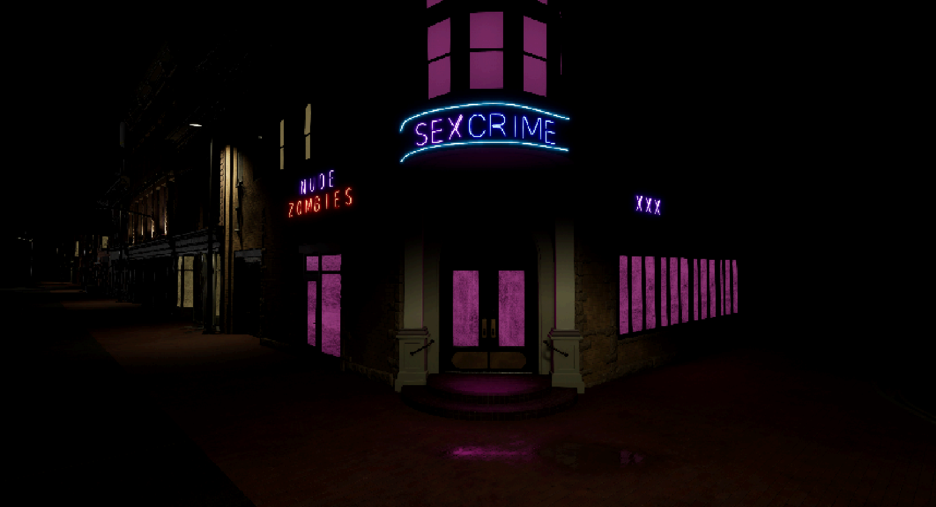
Yes, that sign does say that and don't tell me your mind hasn't crossed it.
With this new tool, I also went back to the demo levels to add some neon signs where one should always have been. Making sure not to go overboard with it and ruin the levels. I also used some of the new asset kits to add a couple of extra background buildings to the Hell's kitchen scene to give a better sense of being in the middle of a massive cavernous city that seems to peer out of the darkness at you.
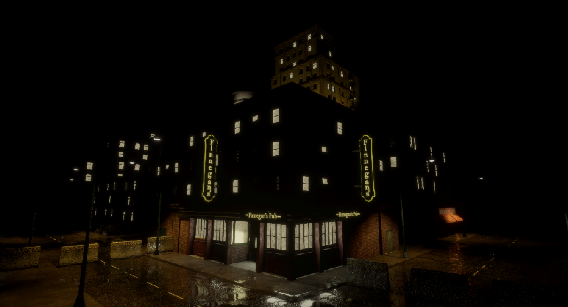
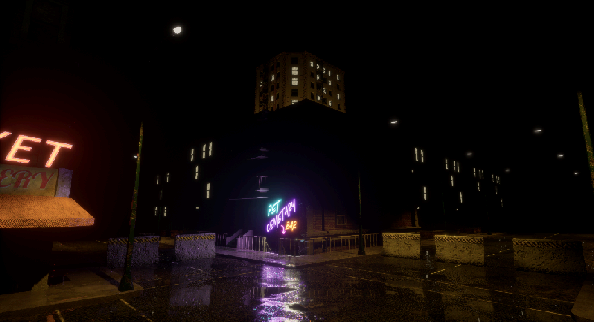
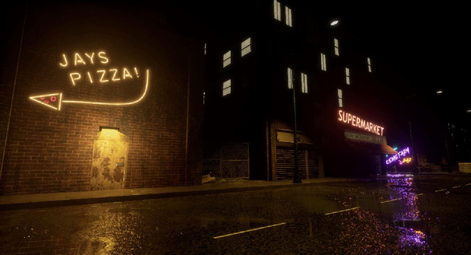
Bonus points if you got the reference.
That does it for this week's extra-long neon heavy edition of Dead Heat Devlogs! Thank you to everyone who has been patient with us for the last couple of weeks and I hope you like what we're doing.
And as always, if you like what you have seen here, please consider donating to the project patreon: https://www.patreon.com/DeadHeat
If you want to support us but can't do it financially? Please share our work on Twitter, Minds and join our community of the dead!
Discord: https://discord.gg/vyrhuGTmej
Twitter: https://twitter.com/saxonbristol
Thank you all for reading, see you next week, partner!
Get Dead Heat
Dead Heat
A Post-Zombie Gothic Noir Adventure Game
| Status | In development |
| Author | Saxon Software |
| Genre | Adventure |
| Tags | Cyberpunk, Female Protagonist, Horror, Multiple Endings, Mystery, Noir, non-eucledian, Story Rich, Zombies |
| Languages | English |
| Accessibility | Subtitles |
More posts
- Bug fix for Dead Heat Winter Build: 21-1-24Jan 21, 2024
- January update 15-1-24Jan 15, 2024
- Winter Build 2023: Foundation ImprovementsDec 25, 2023
- Dead Heat: Spring Build 29-3-23Mar 29, 2023
- Bug fix for Dead Heat: Winter Build 26-2-2023Feb 26, 2023
- Bug fix for Dead Heat: Winter Build 20-2-2023Feb 20, 2023
- It's been a long time.Mar 13, 2022
- Close to the finish line.Jan 24, 2021
Leave a comment
Log in with itch.io to leave a comment.