Cleanup
Hello everyone and welcome to our end of week devlog for Dead Heat.
This week, we focused on a little bit of clean up in preparation for releasing a WIP demo for Dead Heat for everyone to try and get a feel for the kind of game we are working hard to make.
We've upgraded the main menu and new game menu to better reflect Dead Heat's themes and style and provide a cleaner interface. The old main menus were holdovers from our old 2D demo and were always out of place with the new direction we took the project in. For those, reading for the first time, Dead Heat used to look much different than what it does now. The game was originally in 2D and was closer to Fallout than Fear Effect. After we made the move to Unity, we started to shift more towards Fear Effect, Blade Runner and Resident Evil in terms of graphics and gameplay. However, over this time, the menus remained largely the same. I made some attempts to improve the menu with new designs and the introduction of a new game menu.
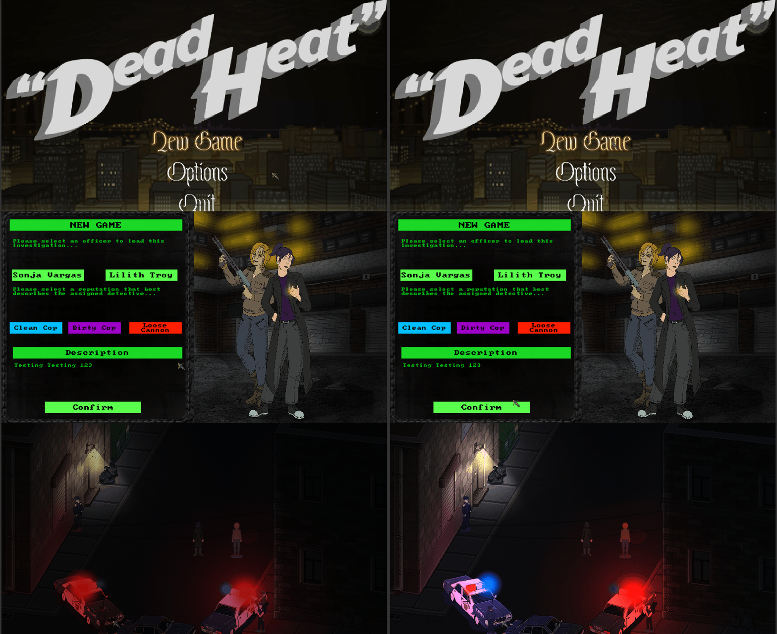
As you can see here. The menus were thrown together using unused UI assets and obsolete designs for Sonja and Lilith. Cluttered, static and ugly. This menu was always interned to be a placeholder for final art assets to be made, but those assets would cost to make and we no longer have a dedicated UI artist on staff. A new kind of menu would be needed. One that utilized the best assets we have, looks stylish and clean to operate.
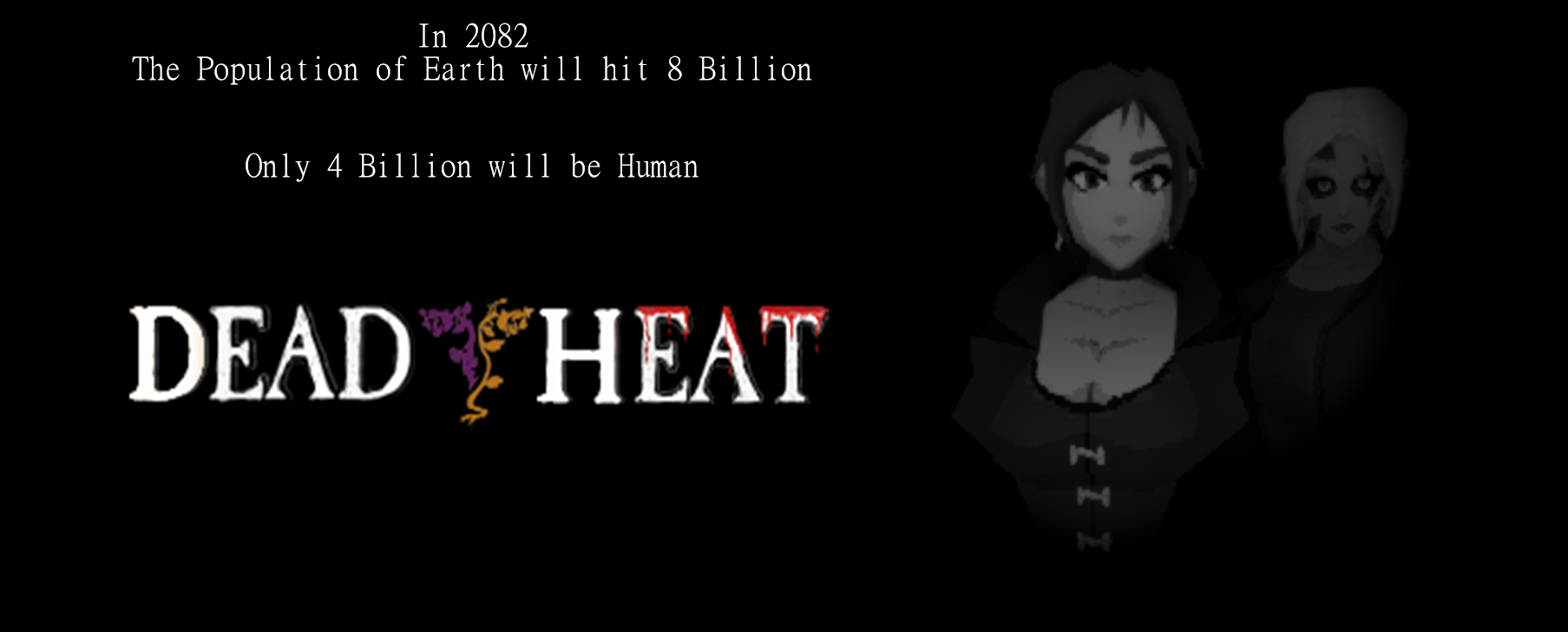
The new menu reflects the games PS1 style while incorporating the games Noir feeling. Utilizing our new access to lighting, 3D models and animation. A menu that would not look out of place on a game made in 1997. A clear statement of intent for what Dead Heat wants to be and what we want to feel like.

If there is any lesson to take from this, it would be the importance of both recognizing what you have at your disposal and the importance of experimentation. The menu retains the layout of the old new game menu but cleans it up. It's not 100% ready just yet. The descriptions need a little bit of editing, and I am looking for more suitable fonts.
Another little area of cleanup that I overlooked during the creation of Lilith's new model textures was setting her model textures up to be used. I left their image type at default instead of sprite, and her filter mode at bilinear instead of point.
Why is this important?
Changing to sprite is a quality thing that stops glitchy imperfections from popping up over the model. The textures filter mode, however, does have much more noticeable differences.
Bilinear makes the textures blend for lower resolution textures. This makes the models appear very blurry. Switching to point makes the texture much sharper and give a much clearer demarcation between cloth and skin.
The best example of this is the difference between these two versions of Lilith's midriff.
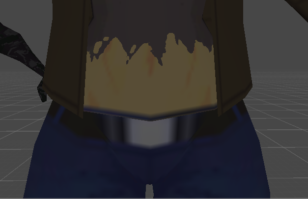
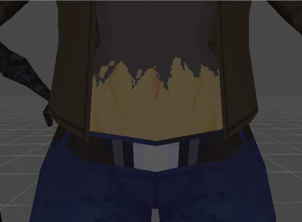
Point is much sharper and closer to what PS1 games would have had.
The next area of improvement was to add in object examining. When you select an object from the inventory, you should be able to see that object in the center of the screen and be able to rotate it. It took a much longer time than anticipated to find a way to get the object to appear on the canvas where we wanted with a screen space camera menu. Chris of AC was able to provide us with a script that would get the linked prefab and create it in the middle of the screen (thanks Chris!), with a few adjustments we were able to create it within the inventory menu canvas.
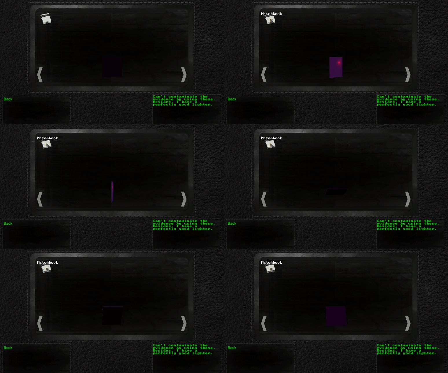
Adding a texture to the evidence objects will be our final task for the inventory.
Given how many features we are planning on adding into the demo, we've decided to add them in over three separate phases. This will give us enough time to add in fully functional gameplay mechanics for everyone to try out and will give everyone enough time to let us know what works and what doesn't. We don't want to be building flawed mechanics into our game, so the sooner we know something doesn't work the better. If all the features in a WIP phase are okay'd by the testers, we will update the demo with the next phase of features.
The first phase WIP will be mostly basic features such as world navigation and UI. We need to make sure that the foundation for the game is solid, so this will be the most important part.
We plan on releasing the first WIP demo tonight if not tomorrow. We will, of course, announce it on twitter as soon as it is ready.
Thank you for reading our devlog! We hope you will stay tuned for our WIP announcement and (hopefully) next weeks devlog!
Get Dead Heat
Dead Heat
A Post-Zombie Gothic Noir Adventure Game
| Status | In development |
| Author | Saxon Software |
| Genre | Adventure |
| Tags | Cyberpunk, Female Protagonist, Horror, Multiple Endings, Mystery, Noir, non-eucledian, Story Rich, Zombies |
| Languages | English |
| Accessibility | Subtitles |
More posts
- Bug fix for Dead Heat Winter Build: 21-1-24Jan 21, 2024
- January update 15-1-24Jan 15, 2024
- Winter Build 2023: Foundation ImprovementsDec 25, 2023
- Dead Heat: Spring Build 29-3-23Mar 29, 2023
- Bug fix for Dead Heat: Winter Build 26-2-2023Feb 26, 2023
- Bug fix for Dead Heat: Winter Build 20-2-2023Feb 20, 2023
- It's been a long time.Mar 13, 2022
- Neon NoirFeb 15, 2021
- Close to the finish line.Jan 24, 2021
Leave a comment
Log in with itch.io to leave a comment.